Overview
TikTok WebApp Design system is supporting central design team which including the LIVE design team (to C), LIVE design team (to B), commercialization design team, Core product UX team etc.
Role
Lead Product Designer
Skills
Design system / Visual design
PLATFORM
Cross platform
CONTEXT
The Lifecycle of an Element
A typical development process
To ensure the well-organized development of the design system, our designers must undergo the entire component design process, starting from scope definition to component testing, usability testing, further documentation, and usability validation. Components usually have a long lifecycle within a design team.


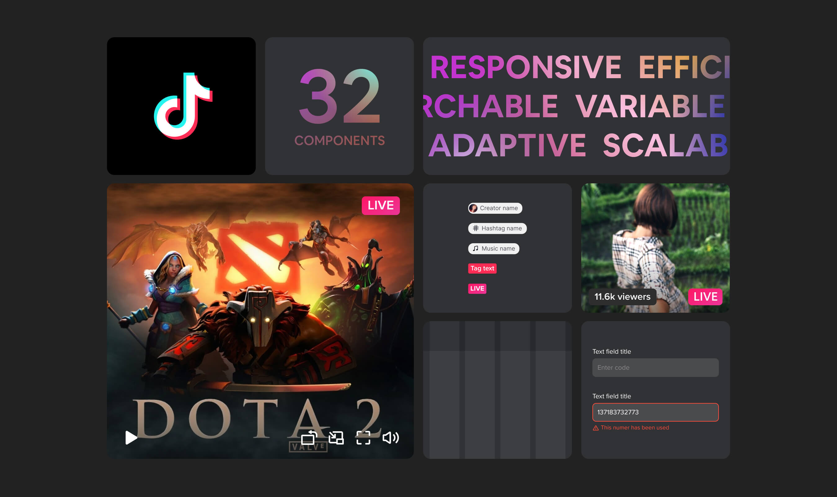
Design system scope
The TikTok Design System supports multiple teams and boasts a sophisticated workflow catering to their needs.


BASIC RULES
Build with variants
Easier to find the components
Designers could find the components just in the variants and switch the same component faster and easier.
Efficient to manage the components
It will automatically revise components in all screens, if designers are using the components master piece.

BASIC RULES
Adaptive component
Adjustable and responsive
The WebApp components should responsive on any size of device. Designer don't need to change the entire component.

PROCESS
Components tracking doc
To track the whole design system process is also a part of the work we do.
The tracking doc includes design status, priority, design Wiki, and development status. The components tracking doc are helping design team and front engineer team to have better knowledge about the whole design system process.

DOCIMENTATION
Structure of the document
Each components will have there own documentation to help our designer better understanding of all the components. The documentation have pretty similar structure: Anatomy, Type(size, functionality, interactions), Layout, and Motion.

DESIGN FILE
Keeping it simple yet scalable
We've built 32 different components, all designed with responsive and adaptive rules, ensuring compatibility across various devices and viewport sizes.


MOTION
Give the components emotions
Haptic feedback can be defined as the “use of the sense of touch in a user interface design to provide information to an end user.” one of the most understudied fields in user experience. As our everyday device interactions shift from keyboard+mouse to phones. Combining haptic touch with interactive motion can offer users a wider range of emotional expression.
Design principle doc
Haptic Touch
Establishing the principles of IOS & Android Haptic Effects. Engineers can directly incorporate effects when our designers designate the specific haptic variant name in their designs prior to shipping.
Components Wiki
Organized all component interaction documents, including extreme cases, while collaborating closely with engineers.

The TikTok motion system comprises transition patterns designed to assist users in comprehending and navigating through in the TikTok app.

Motion guidelines for components
Easy to manipulate
How the components interact and enter or exit the page — is up to each product team to implement. Use this guidance to customize, combine, coordinate, and choreograph this aspect of motion in the UI.
Principles to guide designer
We also support other request when designer have build a new component that need to add motion on it. The curve and duration principle will help then make the decisions.

TESTING
Testing components back to design file
· Less time spent on coding new components
· Handoff is a lot more efficient (less explanation needed to describe elements)
· Less back and forth during QA
· Coded design is a lot more consistent
Create a single source of truth, reduce operation burdens, and minimize errors with a code-to-design design system workflow from UXPin Merge.
TONY
TONY